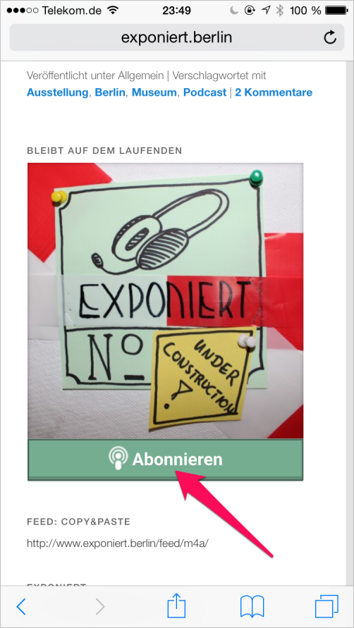
Today it took me several minutes and 3 tries until i found a way to subscribe to the podcast of exponiert.berlin on my iPhone.
I simply couldn’t recognize this to be the subscribe button:

Plus: When viewed mobile, the subscribe button was at the very end of a long page.
While you could blame the website owner to have such a distracting colorful logo, I still wish to have something more “visible”, both in terms of copy as well as colors/icons.
So my suggestion is:
Improve the subscribe button to make it much easier to find on a page.
This may include:
-
No logo, just a button
-
A more direct copy like “Subscribe to the Podcast”
-
A larger button
-
More visible colors
-
A Podcast icon