Templating: Title and Subtitle centered on mobile

Hello,

I have a question about templating the Podlove Web Player. Displaying the Player on mobile devices, the title and subtitle should be centered. Like this:

Screenshot_20210103_121824_org.mozilla.firefox

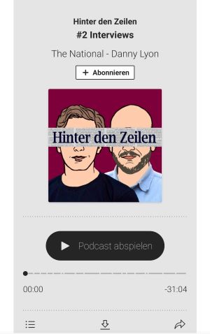
But I noticed, when the title or subtitle are too long and there is a break, there are not centered anymore. For Example:

Screenshot_20210103_121810_org.mozilla.firefox

Screenshot_20210103_121816_org.mozilla.firefox

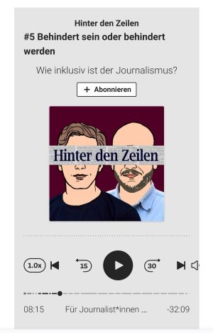
How can I change this, that title and subtitle are always centered? But only on mobile devices!

Thats the code of my template:

<root data-test="player--xl" style="max-width:1024px;min-width:260px;margin:auto;">
  <div class="tablet:px-6 tablet:pt-6 mobile:px-4 mobile:pt-4 flex flex-col">
    <div class="flex-col items-center mobile:flex tablet:hidden">
      <show-title class="text-sm"></show-title>
      <episode-title class="text-base"></episode-title>
      <episode-subtitle class="text-base mb-2"></episode-subtitle>
      <subscribe-button class="mb-4 mobile:flex tablet:hidden"></subscribe-button>
      <poster class="rounded-sm w-48 shadow overflow-hidden"></poster>
      <divider class="w-full my-6"></divider>
    </div>

    <div class="tablet:flex flex-grow">
      <div class="w-64 mobile:hidden tablet:block tablet:mr-6">
        <poster class="rounded-sm shadow overflow-hidden"></poster>
      </div>
      <div class="w-full">
        <div class="hidden tablet:block">
          <show-title class="text-base"></show-title>
          <episode-title class="text-xl desktop:text-2xl"></episode-title>
          <episode-subtitle class="text-base mb-2"></episode-subtitle>
          <divider class="w-full my-4"></divider>
        </div>
        <div class="flex items-center justify-between">
          <div class="block">
            <play-state on="active">
              <speed-control class="flex items-center"></speed-control>
            </play-state>
          </div>

          <div class="flex">
            <play-state on="active">
              <chapter-previous class="mx-2 block"></chapter-previous>
            </play-state>
            <play-state on="active">
              <step-backward class="mx-2 block"></step-backward>
            </play-state>

            <play-button class="mx-2 block" :label="$t('PLAYER.PLAY_EPISODE')"></play-button>

            <play-state on="active">
              <step-forward class="mx-2 block"></step-forward>
            </play-state>
            <play-state on="active">
              <chapter-next class="mx-2 block"></chapter-next>
            </play-state>
          </div>

          <div class="block">
            <play-state on="active">
              <volume-control class="flex items-center"></volume-control>
            </play-state>
          </div>
        </div>
        <div class="flex w-full">
          <progress-bar></progress-bar>
        </div>
        <div class="flex w-full -mt-2">
          <div class="w-3/12 text-left">
            <timer-current class="text-sm"></timer-current>
          </div>
          <div class="w-6/12 text-center truncate">
            <play-state on="active">
              <current-chapter class="text-sm"></current-chapter>
            </play-state>
          </div>
          <div class="w-3/12 text-right">
            <timer-duration class="text-sm"></timer-duration>
          </div>
        </div>
      </div>
    </div>
    <divider class="w-full mt-6 mb-3"></divider>
    <div class="flex justify-between">
      <div class="flex mobile:w-full tablet:w-3/12 desktop:w-3/12 justify-between">
        <tab-trigger tab="chapters">
          <icon type="chapter"></icon>
        </tab-trigger>
        <tab-trigger tab="files">
          <icon type="download"></icon>
        </tab-trigger>
        <tab-trigger tab="playlist">
          <icon type="playlist"></icon>
        </tab-trigger>
        <tab-trigger tab="share">
          <icon type="share"></icon>
        </tab-trigger>
      </div>
      <subscribe-button class="mt-1 mobile:hidden tablet:flex"></subscribe-button>
    </div>
  </div>
  <div class="w-full relative overflow-hidden">
    <tab name="chapters">
      <tab-chapters></tab-chapters>
    </tab>
    <tab name="files">
      <tab-files></tab-files>
    </tab>
    <tab name="playlist">
      <tab-playlist></tab-playlist>
    </tab>
    <tab name="share">
      <tab-share></tab-share>
    </tab>
    <tab-overflow></tab-overflow>
  </div>
  <error></error>
</root>

And thats the website of my podcast:
Hinter den Zeilen - Der Journalismus-Podcast

Thank you very much!

There is a tailwind helper class available called text-center, applied to your case this would look like this:

<root data-test="player--xl" style="max-width:1024px;min-width:260px;margin:auto;">
        <div class="tablet:px-6 tablet:pt-6 mobile:px-4 mobile:pt-4 flex flex-col">
          <div class="flex-col items-center mobile:flex tablet:hidden">
            <show-title class="text-sm"></show-title>
            <episode-title class="text-base text-center"></episode-title>
            <episode-subtitle class="text-base text-center mb-2"></episode-subtitle>
            <subscribe-button class="mb-4 mobile:flex tablet:hidden"></subscribe-button>
            <poster class="rounded-sm w-48 shadow overflow-hidden"></poster>
            <divider class="w-full my-6"></divider>
          </div>
      
          <div class="tablet:flex flex-grow">
            <div class="w-64 mobile:hidden tablet:block tablet:mr-6">
              <poster class="rounded-sm shadow overflow-hidden"></poster>
            </div>
            <div class="w-full">
              <div class="hidden tablet:block">
                <show-title class="text-base"></show-title>
                <episode-title class="text-xl desktop:text-2xl"></episode-title>
                <episode-subtitle class="text-base mb-2"></episode-subtitle>
                <divider class="w-full my-4"></divider>
              </div>
              <div class="flex items-center justify-between">
                <div class="block">
                  <play-state on="active">
                    <speed-control class="flex items-center"></speed-control>
                  </play-state>
                </div>
      
                <div class="flex">
                  <play-state on="active">
                    <chapter-previous class="mx-2 block"></chapter-previous>
                  </play-state>
                  <play-state on="active">
                    <step-backward class="mx-2 block"></step-backward>
                  </play-state>
      
                  <play-button class="mx-2 block" :label="$t('PLAYER.PLAY_EPISODE')"></play-button>
      
                  <play-state on="active">
                    <step-forward class="mx-2 block"></step-forward>
                  </play-state>
                  <play-state on="active">
                    <chapter-next class="mx-2 block"></chapter-next>
                  </play-state>
                </div>
      
                <div class="block">
                  <play-state on="active">
                    <volume-control class="flex items-center"></volume-control>
                  </play-state>
                </div>
              </div>
              <div class="flex w-full">
                <progress-bar></progress-bar>
              </div>
              <div class="flex w-full -mt-2">
                <div class="w-3/12 text-left">
                  <timer-current class="text-sm"></timer-current>
                </div>
                <div class="w-6/12 text-center truncate">
                  <play-state on="active">
                    <current-chapter class="text-sm"></current-chapter>
                  </play-state>
                </div>
                <div class="w-3/12 text-right">
                  <timer-duration class="text-sm"></timer-duration>
                </div>
              </div>
            </div>
          </div>
          <divider class="w-full mt-6 mb-3"></divider>
          <div class="flex justify-between">
            <div class="flex mobile:w-full tablet:w-3/12 desktop:w-3/12 justify-between">
              <tab-trigger tab="chapters">
                <icon type="chapter"></icon>
              </tab-trigger>
              <tab-trigger tab="files">
                <icon type="download"></icon>
              </tab-trigger>
              <tab-trigger tab="playlist">
                <icon type="playlist"></icon>
              </tab-trigger>
              <tab-trigger tab="share">
                <icon type="share"></icon>
              </tab-trigger>
            </div>
            <subscribe-button class="mt-1 mobile:hidden tablet:flex"></subscribe-button>
          </div>
        </div>
        <div class="w-full relative overflow-hidden">
          <tab name="chapters">
            <tab-chapters></tab-chapters>
          </tab>
          <tab name="files">
            <tab-files></tab-files>
          </tab>
          <tab name="playlist">
            <tab-playlist></tab-playlist>
          </tab>
          <tab name="share">
            <tab-share></tab-share>
          </tab>
          <tab-overflow></tab-overflow>
        </div>
        <error></error>
      </root>

Works perfectly, love it! Thank you very much for this quick reply on a sunday :slight_smile:

1 Like