Comparing episodes is difficult

If we assume that the community of listeners grow with each episode, a direct comparison of download numbers actually is not valid since every new episode will have a slightly bigger number of downloads than the previous ones.

So how can we then measure if an episodes performs better or worse than other episodes?

I assumed the following:

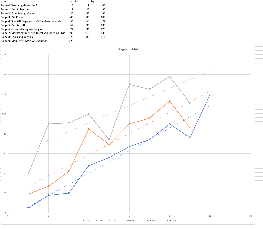
Given that you publish on a (more or less) regular basis with a continuous quality of content I assume that the number of listeners grows linearly. Given that we can calculate a linear regression over all episodes’ downloads at the same given time after publication.

The deviation of the regression then shows how a specific episode performs.

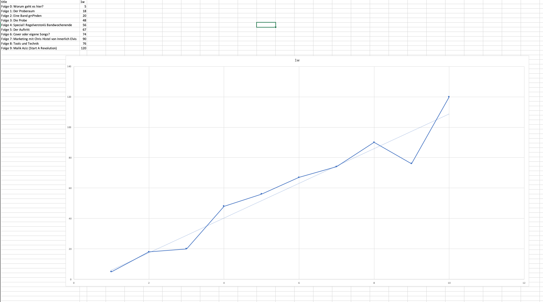
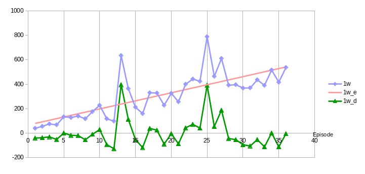
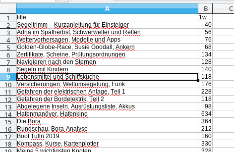
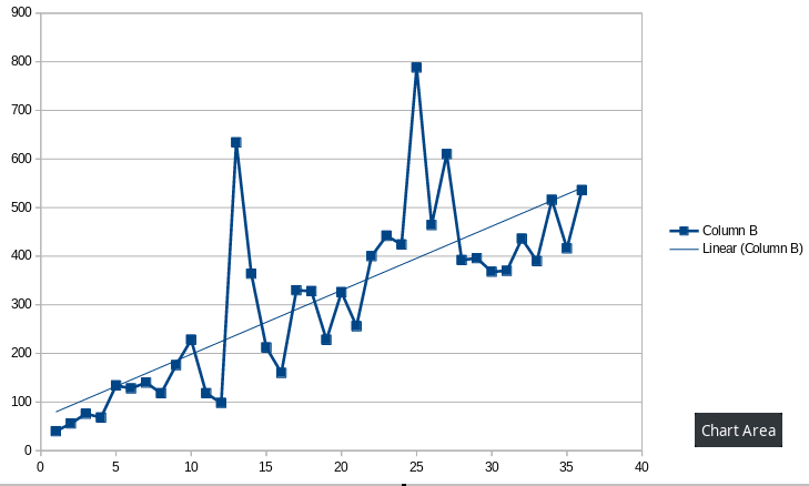
Have a look at the diagram: the x-axis is the episode number, on the left side the 1st episode, on the right side episode 36. The y-axis shows the number of downloads. The blue line is the number of downloads per episode after 1 week (1w) and the red line is the linear regression of it.

As we can see – even without regression line – the line on average increases with every new episode.

The green line shows the difference between the actual value and the predication of the regression. If a number is above 0 it performs better than the average and if it is less than 0 it performs worse.

In the diagram we can see that e.g. episodes 13 and 25 had exceptional high downloads. This would have been obvious even without this diagram. But we can also see that e.g. episodes 9 and 10 performed much better than episodes 19 and 21 although the absolute download numbers of 19 and 21 are greater than those of 9 and 10.

image

I made this diagram with Libreoffice Spreadsheet which is pretty easy.

What do you think about my assumptions? Did I overlook something or does it make sense to you?

Would it make sense to implement this into the online analytics?

Best regards,
Bernhard

1 Like

I quite like this as it gives an at-a-glance answer to the question “How’s my podcast doing/growing?” and at the same time makes comparing episodes possible.

The green line could be visualized better I feel: green if above zero, red if below zero, maybe. But all in all, definitely a widget to consider for adding.

1 Like

Of course the visualization can be highly improved. I did this diagram just as a proof of concept.

This is awesome Bernhard! Looking forward.

This is really really cool! Can you share your Spreadsheet somehow and do a little explanation what source (CSV from Podlove analyics i asume) to use?

Ok, here we go.

I did my diagram a little bit more complex than this explanation but this here leads to the same result.

Note: Please note that I assumed a regular publishing schedule and a linear growth of downloads. I think that after a certain point in time, the downloads will not increase linearly anymore because there is no such thing than an endless everlasting growth. I think that the growth will be a logarithmic function in the long term after years of podcasting. But this is just an assumption. I only have data from my own podcast which I publish since exactly one year.

This is a quick HOWTO. It is based on Libreoffice 6.1.5.2 but I guess it should work with MS Excel very similar.

Step 1: Go to Podlove → Analytics and scroll down to “Export as CSV”, click “Export” and save the file somewhere on disk.

Step 2: Run Libreoffice Calc and open the CSV file. The import settings window will popup. Choose “Separated by” and “Comma” (if not selected by default) and click “OK”. The spead sheet will open.

image

Step 3: Delete all columns except title, id, and 1w. Now you have title in column A, id in column B and 1w in column C.

Note: You could use a different time column, e.g. 2w or 3w but as to my observation the download relations settle at 1w or at least 2w. That means that there are not much changes in respect to the podcast performance. So I think either the column 1w or 2w fit best for this comparison.

Step 4: Now we sort it ascending (not necessarily required). Mark all cells (all three columns and all rows, only the data cells, NOT the title row) and go to the menu Data → Sort. Choose “Sort Key 1” as “Column B” “Ascending” and click “OK”.

Step 5: Delete the id column. It’s not used any more. Your spreadsheet should now look like the following, having the first episode on top:

image

Step 6: Create the chart. Again mark all cells and in the menu choose “Insert → Chart”. The chart wizard opens. Choose chart type “XY (Scatter)” and “Points and Lines” and click “Finish” and a diagram will appear.

image

Step 7: Right-click at any point of the curve in the diagram. A context menu will appear. Choose “Insert Trend Line…”. A window will open choose “Regression Type” “linear” and press “OK”.

image

Best regards,
Bernhard

Just another note: If there are some exceptional outliers, it is valid to just delete them as the may distort the result. So in my case I further deleted episodes 13 and 25 from the chart (In the diagram above you can see that they both have a more than average high value. Although both are true downloads because they both share a very similar topic, it still distorts the result a little but…you might think that this is just cosmetics… :wink: )

Wow, supercool! Thanks!

1 Like

Works like a charm!

image

Added 4w and 1q - interesting to play with!

image

Yes but as I wrote, as you can see in your diagram, there is no real difference between these. The regression specifically is meant to compare performance of episodes to each other.

Bernhard

understood