Customise the Download Interface
There are three ways listeners can consume your podcast:
- Feed subscription in any podcast client
- Listening on your website via web player
- Downloading the audio file
Listeners prefer different ways to consume your podcast and you should be aware of each of them to provide an ideal listening experience.
Downloading files is the basic method. Both podcast clients and web players are abstractions on downloads. Podcast clients subscribe to a feed and automatically download new episodes for you. Web players hide the technicality of downloading media behind a play button. But downloads are the core, no matter which method is chosen.
While podcast clients and web players are convenient, they dictate how the media is consumed. Some listeners ask for more flexibility. They might want to burn some episodes on a CD and listen to it in a car. Or they are fans of curl or wget. Either way, they need the option to download your files.
There are two download interfaces in the Publisher. I will explain how to switch between them, discuss why you would choose one over the other, and the reasoning behind the default interface in the Publisher.
Switching Download Interfaces
All code shown is template code. If you have not touched templates yet, you are still using one, maybe without knowing. Check “Podlove > Templates”. There you will see the default template. For experiments, I suggest you copy and paste its contents into a new template.
Recent versions of the Publisher come with this line in the default template:
{% include "@core/shortcode/downloads-select.twig" %}
It is responsible for displaying the download buttons and looks like this:
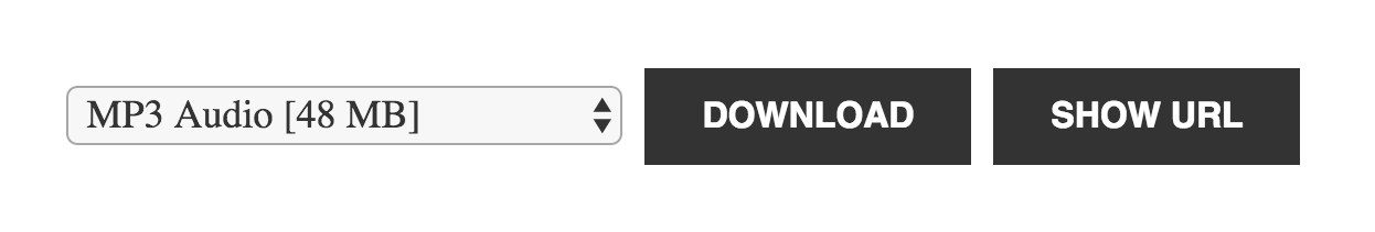
Try the alternative by replacing that line with this one:
{% include "@core/shortcode/downloads-buttons.twig" %}
It looks like this:

That was easy, wasn’t it?
All Publisher core templates are barely styled. This is a conscious choice, so they can inherit the styles defined by the theme. Feel free to enhance their looks with custom CSS if you want.
If that is not enough, you can copy and edit the actual templates. You can find their code in the documentation. Downloads Select and Buttons Templates
Which option is best for your podcast?
Before choosing a download user interface you should understand why we picked the default as the default for everyone. It is not perfect. It is a compromise.
The goal behind this design was to make it easy and obvious—even to nontechnical listeners—how to download an episode. By creating the select interface, we removed the requirement to choose an asset. Even if the podcaster offers four different audio formats, there is one preselected for the listener and a single big button screaming “download” is easy to understand. The listener does not need to decide anything. One click on “download” and she is done.
However, we also wanted to enable more technically interested listeners flexibility to do two things: First, to choose their preferred format. The default, probably mp3 or m4a, is great for most people, but if you offer other formats like ogg and opus, I can guarantee there are some listeners who prefer those. The select interface enables the listener to her choice. Second, some listeners prefer to get the media URL and use it with their tools instead of downloading files in the web browser. That is what the “Show URL” button is for.
Let’s look at the shortcomings of the select interface:
- It is not very pretty. As mentioned earlier, when we create templates, we try to only provide markup and hope the theme takes care of the rest. If we add our own colours, sizes and margins, it will look “out of place”. However, few themes style their selects and buttons in a way that looks good for this interface.
- You cannot right click and “save as…” on a button, like you can do on a link. Some listeners miss that.
- It seems overly complex if you only provide a single format.
Let’s compare this to the alternative interface, a list of links/buttons. Since they are just links in the markup, they are easier to style than the select default and might look better without styling. It is possible to right click and “save as…”.
The main reason this list is not the default is that it leaves the listener with a choice she may not want to make. If you offer mp3, m4a, ogg and opus, your listener needs to choose one. In the download-link interface, all four options appear of similar importance. For a nontechnical listener this can be confusing.
So which one is better? The decision remains yours.
One more thing
You may have noticed that when you click the download link or button, no download is happening. Instead, the browser plays the file with its built-in player. Both download interfaces have this problem and unfortunately this is not fixable within the Publisher. The web server needs to be configured to force browsers to download. I made a short tutorial for that a while ago: How to enable Force Downloads & Fix Mime Types
This article first appeared in the “Publisher Weekly” Newsletter. Subscribe to get new articles delivered to your inbox.